Case Study
Obi
(Previously called Bellhop)
Head of Growth
Marketing
Product Strategy
UI/UX Design


Table of Contents

Introduction
Fresh out of college, I was balancing my time as an independent contractor, taking on web development and digital marketing projects while searching for the right opportunity. I had just left a job at Atlantic Records, where I loved the music scene but got frustrated with all the corporate bureaucracy. I felt I wasn’t able to contribute in any meaningful capacity because I was only using a fraction of my skillset because of the rigid rules and slow-moving creative departments. I realized I needed a more dynamic environment where I could learn and grow without so many constraints—something that only a startup could offer. So, I started looking for startups in need of someone with my skills, while freelance work kept me afloat.
In 2017, Obi (then called Bellhop) was an early-stage tech startup fueled by around $1 million from angel investors. The vision was ambitious: an all-in-one concierge services app aggregating everything from food delivery, event tickets, reservations, tours and transportation. However, at that time, the only functional service was ride-hailing aggregation— where users could compare prices from Uber and Lyft from within the same app.

obi's pitch deck at the time (july 2017)
Background
The Job
I jumped on board with Obi as Head of Growth in June 2017, and I was ready to dive into the startup world. I wanted to be somewhere dynamic, where I could really make an impact. My job covered a bit of everything—market analysis, strategy development, and driving growth initiatives. The main goal? Grow Obi’s user base by any means necessary.
But it wasn’t just about getting new users. I was also focused on keeping them happy and engaged. I teamed up with the product crew to tweak and enhance the app based on what users told us. We worked hard to make sure new users quickly saw the value of Obi and became regulars. I kept a close eye on key performance indicators (KPIs) and used data to constantly tweak our strategies. It was all about hitting our growth targets and giving our users the best experience possible.
Initial Challenges
When I joined Obi, the company was still in its infancy and faced several significant challenges. First and foremost, we had a very small team—just three employees, supported by about four remote engineers. This meant that every team member had to wear multiple hats, stretching their skills and time across various responsibilities.
Our resources were extremely limited. With the need to extend our runway as long as possible, we had little-to-no budget for anything other than the absolute necessities. This financial constraint made it difficult to invest in marketing, user acquisition, or even advanced tools and technologies that could aid our growth efforts.
Moreover, Obi had not yet found a proven product/market fit. The app's strategy was too broad, trying to be an all-in-one concierge service, which resulted in a complex and unfocused user experience. This lack of clarity made it hard for users to see the app's true value. At that time, we had very little traction, with under 100 monthly active users, making it challenging to gather meaningful user feedback and iterate on the product effectively.
To complicate matters further, we had no formal agreements with any major service providers like Uber or Lyft. This lack of official partnerships meant that we were operating without guaranteed access to critical data and services that were essential for our app's functionality. These hurdles made our mission clear: we needed to focus our strategy, optimize our resources, and look for opportunities to transform Obi into a viable and competitive product in the rideshare aggregation market.
Strategy Development
Research
The first step was to conduct thorough research and identify key growth opportunities. By diving deep into historical data and user feedback, I aimed to understand which aspects of the app were resonating with users and which were falling flat.
With four different services offered in the app, it was crucial to determine which service was used most frequently. We analyzed the usage patterns and found that rideshare comparison was the dominant feature, with over 95% of users relying solely on this service.
To gain deeper insights, I reached out to users directly. I wanted to understand their motivations for using the app, which services they found valuable, and which they didn't. The feedback was clear: users overwhelmingly valued the rideshare comparison feature and had little to no interest in the other services.
Insights
Based on my research, one thing was extremely clear: users appreciated the ability to compare rideshare options in one place and were not looking for an all-in-one concierge service.
Armed with this critical insight, I realized that our broad focus was diluting our efforts and confusing potential users. We needed to streamline our strategy and focus on what truly mattered to our audience.
Strategy Formulation
Based on my research and the insights I came away with, I proposed the following approach to the team:
Pivot Product Strategy
It was evident that rideshare comparison was the only service our users truly valued. To capitalize on this, we needed to pivot our business strategy to focus exclusively on this feature. It's better to be a master of one than a jack of all trades.
Redesign App for Rideshare Comparison
With our new focus, the next step was to redesign the app around rideshare comparison. The goal was to develop an app that could rival industry leaders like Uber and Lyft. We needed to create an intuitive, user-friendly interface that made comparing ride options seamless and efficient. Speed was of the essence, as we needed to roll out these changes quickly to retain and attract users.
Improve and Refine Core Product
Once the redesigned app was launched, it was then that the work really began. We needed to engage with our users to identify any pain points or areas for improvement. This feedback would then be prioritized, and fixes would be implemented as quickly as possible. This iterative process was crucial for refining the app and ensuring it met user needs effectively.
By following these steps, we aimed to prove product/market fit and lay the foundation for sustainable growth. The focused strategy would allow us to enhance the user experience, build trust, and differentiate ourselves from competitors. Through continuous improvement and user-centric development, we were confident in our ability to grow and succeed in the competitive rideshare market.
Implementation
The Redesign
Being cash-strapped, we had no budget to hire an outside UI/UX designer. Fortunately, my extensive experience as a freelance app designer came in handy, so I decided to handle 100% of the redesign myself. This approach would significantly minimize costs while allowing us to move quickly.
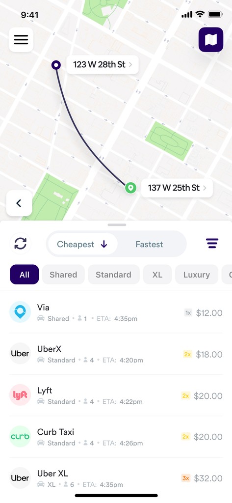
My strategy for the redesign was straightforward: follow the guidelines set by Uber and Lyft. The goal was not to reinvent the wheel but to create an experience that felt familiar to our users. A familiar interface would ensure that users instinctively knew how to navigate the app. The redesign focused on two primary screens: the map landing screen and the compare screen.
Map Landing Screen
The map screen is the first thing users see when they open the app. The main objective was to provide users with a clear call-to-action to either (a) set their pickup location (based on their current location) or (b) input their destination address.
From our analytics, we knew that over 98% of our users granted permission to use their current location. Additionally, approximately 80% of ride requests used the current location as the pickup point. Therefore, I prioritized the 'enter your destination' call-to-action over 'enter your pickup location.' This design choice streamlined the process for most users, making it quicker and more intuitive.
Compare Screen


APP REDESIGN - BEFORE AND AFTER
Relaunch
By September 2017, we re-launched the app in the App Store. The response was immediate and overwhelmingly positive, with users praising the improved ease of use and overall usability.


bellhop app reviews, post-redesign
Growth: Part 1
Tracking
When it comes to finding leaks, or areas for improvement, one of the most critical tools is your product’s data and analytics. Properly tracking key events within the app flow is essential for gaining insights into user behavior and identifying where users encounter issues.
For Obi, we set up custom events to monitor important goal funnels:
→ Onboarding Funnel
app install → sign-up → sign-up completed
This funnel tracks users from the initial installation to completed signup. It helps us understand how many users install the app but never complete the signup process, highlighting potential barriers to entry.
→ core funnel
Session start → Ride Search → Ride Compare → Ride Booked
This is our core funnel, tracking how many sessions end with a successful booking. Sessions that complete this funnel are considered successful, giving us a clear picture of how effectively the app is facilitating ride bookings.
By leveraging these funnels, we could identify where users were dropping off and take targeted actions to improve the user experience. Optimizing these key areas was essential for increasing user retention and ensuring the app's success.
Marketing

bellhop's growth from may 2017 to january 2018
The Uber Standoff
One evening in late January 2018, we received an email from Uber that felt like a punch to the gut. They claimed we had violated their API Terms of Service because we were also showing prices from other rideshare companies like Lyft. This was clearly anti-competitive behavior, but it didn’t matter because they had the power to shut down our API access. And that’s exactly what they were going to do within 24 hours.
To say this was a big problem would be an understatement. Obi's entire business model, our technology, and our very existence relied on Uber's API. We had built our platform around the ability to compare pricing between Uber and Lyft, offering our users the best options for their rides. Without Uber, our app was like a boat without a motor—nice to look at but not useful.
We were shocked, but immediately motivated to find a solution, knowing that we needed to move as fast as possible. We called an emergency meeting with our engineering team in Poland early the next morning. We spent nearly the entire day on Zoom calls, trying to find a path forward. By the end of the day, we had a plan. But it wasn't a simple one.
We knew relying on a single workaround would be too risky for the business, so we decided to develop multiple ways to access Uber’s pricing. This was our insurance policy against any future blocks. We considered every option, even trying to replicate Uber’s pricing algorithm through a machine learning model.
After some research and discussion, we settled on two main methods:
Scraping Uber's Web Pricing Tools:
In this scenario, we would scrape pricing from various locations on the web, including Uber's price estimate tool as well as via other services that use Uber's API to provide pricing such as RideGuru. This solution would work but had two significant drawbacks. The pricing wasn’t always accurate, especially during surge periods, and the system was unreliable and prone to bugs. Despite its limitations, it was a start.
Requesting Users to Provide Access to Their Own Uber Accounts:
This was (and still is!) the preferred solution. By asking users to link their Uber accounts directly within the Obi app, we could pull pricing data through each user’s individual account. This method made it impossible for Uber to shut us down without also shutting down their own users' accounts. Additionally, it allowed us to show individualized pricing—if a user received a 20% off coupon from Uber, the user would see that discounted price in Obi when they connected their account.
Creating these workarounds wasn't easy. Over six intense months, our engineers poured their hearts and skills into developing six different methods to make sure we could always offer our users accurate Uber pricing. We anticipated that Uber might try to block each method, but we were equipped with multiple solutions and ready to switch from one to another without missing a beat.
Those days were a rollercoaster—filled with stress but also charged with excitement. We were all in, committed to keeping Bellhop alive. The entire team's unwavering determination was nothing short of inspiring. We were united in our goal: failure was simply not an option. Our engineers showed incredible creativity and resilience, tackling each challenge with courage and ingenuity.
Ultimately, all our hard work and persistence paid off. We successfully rolled out our complex strategy, ensuring that Obi could continue delivering the crucial services our users relied on. The standoff with Uber taught us valuable lessons about resilience and innovation. It was a landmark moment for Obi, solidifying our ability to adapt and triumph over even the toughest challenges.
Growth: Part 2
After the Uber situation, our active users had plummeted to nearly zero. Six months later, we were ready to relaunch, now with redundancies for not only Uber, but also Lyft pricing. We weren’t taking any chances. This period was crucial for Obi as we needed to rebuild trust with our users.
While our engineers worked tirelessly on the technical side, ensuring our multiple workarounds for accessing Uber and Lyft pricing were robust, I focused on enhancing the user experience. We knew that to win back users, our app had to be not only functional but exceptional.
I developed a product strategy centered around three key objectives:
Nail the basics
Our users were already familiar with Uber and Lyft, so it was critical to create an intuitive and familiar experience. Without this, the app had no chance.
Build confidence
As a metasearch platform, Obi needed to gain the trust of users. The primary way to do this was to ensure pricing accuracy and transparency. We focused on two main areas: providing exact pricing as often as possible and clearly communicating when the pricing might be imprecise.
→ ACCURACY
To provide the most accurate pricing information, we encouraged users to link their Uber and Lyft accounts. This guaranteed that the pricing and ETA information would always be exact. We significantly increased the number of users with both Uber/Lyft accounts created by making the linking process as simple as possible.
Another way we improved pricing accuracy was by automatically refreshing the pricing and ETA information on the compare screen every 15 seconds. This would ensure the user is always seeing the latest pricing.
→ TRANSPARENCY
Despite our efforts to ensure accuracy, there would still be scenarios where the pricing or ETA information might be flawed. That’s why our second guiding principle was transparency. We needed to communicate clearly with users when the pricing might not be accurate.
If a user hadn’t linked their Uber or Lyft account, we displayed a notice explaining that the pricing might be slightly inaccurate.
We integrated features that allowed users to see the origin of the pricing data, reassuring them about the reliability of our service.
Create value for users
In our journey to truly dazzle our users and elevate their experience, we recognized the need to not just meet but exceed their expectations by delivering exceptional value. The challenge was clear: to introduce groundbreaking features that would simplify decision-making and enhance the overall utility of our app.
We dove deep into our extensive data reserves, tapping into a wealth of raw, unprocessed information. From this, we crafted features designed to streamline and enrich user interactions with our app. Our engineers and data scientists worked tirelessly, weaving complex machine-learning models that could offer not just insights but predictions about future ride costs and conditions.
Our goal was to transform how users engaged with our service, making it easier than ever to choose the right ride at the right time. We introduced a suite of smart features that did more than just inform—they anticipated. For instance, our surge pricing indicator utilized real-time data to show users when fares were likely to increase, giving them the chance to book rides before costs escalated.
Moreover, our predictive algorithms took this a step further by forecasting price fluctuations over the next several minutes to hours. This feature was revolutionary, giving our users the power to decide the best time to book a ride based on upcoming price changes, potentially saving them money during peak times.
Each new functionality we introduced was designed with our users' needs in mind, aiming to make their ride-hailing experience as efficient and economical as possible. Through these innovations, Obi stood out not just as a tool for comparing rides but as a smart companion that guided users through their travel decisions, making every journey smoother and more cost-effective.
→ surge trends
Similar to how Google Maps shows you how busy a place is at any given time, we utilized our data sets to create a 'surge' timeline. This feature allows users to see when surge pricing is likely to occur, helping them decide whether to book a ride now or wait for a better fare. This insight empowered users to make more informed decisions and save money on their rides.
→ FARE CHANGE PREDICTIONS
Using the same extensive data, we developed a sophisticated machine learning model that could predict fare changes within the next 5, 15, and 30 minutes with over 85% accuracy. This feature provided users with foresight into fare fluctuations, allowing them to time their bookings perfectly to get the best price. By anticipating fare increases or decreases, users could plan their rides more strategically.
→ SURGE HEATMAP
Obi's Surge Heatmap is an innovative feature designed to help users visualize surge pricing in New York City. The heatmap displays the surge multiplier in specific areas at any given time, allowing users to see where higher fares are concentrated.
With the Surge Heatmap, users can save money by walking a few blocks to take advantage of lower fares in nearby areas. This feature empowers users to make informed decisions and avoid paying inflated prices during peak times.
→ pickup location optimization
In cities with heavy traffic and one-way streets, choosing the right pickup location can save significant time. Our innovative feature identified the best pickup spots within two blocks of a user’s current location, optimizing for the quickest route to their destination. This feature was particularly valuable in busy urban areas, helping users avoid unnecessary delays and get on their way faster.


Mobile Screens

obi's pitch deck in 2020
Ready to download the app?


Credits
Services
Growth
Market Research
A/B Testing
Analytics/Tracking Setup
Data Analysis
Segmentation Analysis
User Acquisition Cost Analysis & Optimization
Product
Product Strategy
Product Management
Feature Prioritization
User testing
Roadmap planning
Funnel optimization
Retention strategies
Technical spec writing
Marketing
Marketing Strategy
Digital Marketing
SEO/SEM
Attribution
Conversion Rate Opt. (CRO)
Content Marketing
Email Marketing Automation
Design
UI/UX Design
Interaction Design (IxD)
Wireframing/Prototyping
Prototyping
User research
Tools
Project Management
Jira
Trello
Data/Analytics
Segment.io
Mixpanel
Google Firebase
Google Analytics
Google BigQuery
Branch.io
SendGrid
AppSee
Planning
Confluence
Miro
Notion
Design
Figma
Sketch
Marketing
Facebook Ads
Google Ads
Other
Google Search Console
Wordpress
team
Founder
Payam Safa
Product/Growth
Kevin Ross
Consultant
Nick Ferris
Sr. Mobile Engineer
Sebastian Sztemberg
Sr. Backend Engineer
Damian Bronecki